According to Statista, 52.2% of all web traffic came through mobile devices in 2018, highlighting the importance of conversion rate optimization for e-commerce store owners to capitalize on this opportunity.
They haven’t been able to capitalize on this opportunity primarily because users behave differently on desktop and smartphone devices.
In this article, we will examine five ways to increase your e-commerce conversion rate for mobile devices using CRO (Conversion Rate Optimization).
1. Improve Website Speed and Efficiency
Let’s face it. Mobile users are not as patient as you might think. A delay of a couple of seconds is enough to make them leave your website.
In fact, according to a study by Google, the average time required to load a mobile webpage is 22 seconds, yet 53% of visitors will abandon the website if it takes more than 3 seconds to load.
To improve the speed and efficiency of your website, make sure you are optimizing the following 2 aspects:
Website Speed
To retain your mobile website visitors, you can rely on Progressive Web Applications (PWAs). PWAs are web applications that offer in-app functionalities in a browser environment, combining the best of both worlds.
PWAs allow you to deliver a smooth experience despite a slow internet connection. Moreover, if you are not connected to the internet, the app will transmit data once the app is back online.
To gain a deeper understanding of your site, you can run your website through Google’s PageSpeed Insights and you can check the mobile compatibility of your website here.
Time to Interact (TTI)
TTI measures the time taken by the page to become interactive, i.e., it’s the moment when the user can interact with the web page once the first visual content appears on the screen. To optimize TTI, it’s a good practice to load interactive and high-priority elements first. Here are three tips to optimize the TTI:
- Load above-the-fold elements first
- Among them, load the essential interactive elements first. For example, loading the Add to Cart CTA is more important than loading social sharing icons.
- Compress images with TinyPNG without impacting their quality
Bonus Tip
Use geolocation to determine the location of the user so that you are reducing one more step the user has to take, making the process even more efficient. Here is how Amazon does it:
2. Maintain a Minimalistic Approach to the Smartphone Experience
Let’s imagine you land on a page that is cluttered with way too much information and pop-ups showing up out of nowhere. With so much disarray, you would hardly be motivated to stick around.
The adage “Less is more” holds true regarding conversion rate optimization for mobile websites. Keep content as low as possible to increase the conversion rates and the chances of the visitor purchasing. You don’t want to bore them with too much jargon to the point where they exit your webpage.
- To make your website minimalistic, here are three simple suggestions:
Remember to optimize your page load speed - Convey the key product features in a bulleted list format
- Avoid using pop-ups, as a wrong tap might divert the user from completing their purchase
3. Design for the Thumb
The screens of smartphones have grown bigger in recent times. Although this brings the perfect opportunity to design experiences for accurate finger taps, user behavior doesn’t necessarily fit this assumption. Smartphone users predominantly use their thumb when holding the device single-handedly.
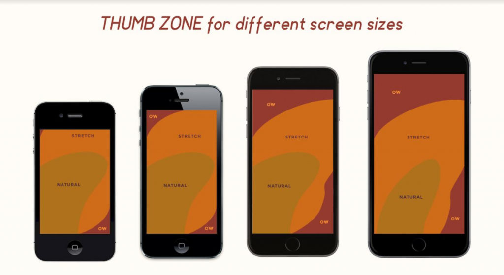
This restricts the area where the thumb can move freely. Steven Hoober introduced The Thumb Zone in his 2011 book Designing Mobile Interfaces. According to Steven, the thumb zone is the most comfortable area for touch with one-handed use.
Therefore, to provide a user-friendly experience, remember the thumb zone when designing for mobile devices. Below is the thumb zone for different screen sizes:

In the above representation, the areas named Natural are the most optimal to place content. Areas titled Stretch are the ones where you can place content which doesn’t have high priority. OW areas should be strictly avoided.
Conversion Rate Optimization Best Practices:
The following are some of the key conversion rate optimization best practices for mobile that you’ve to keep in mind.
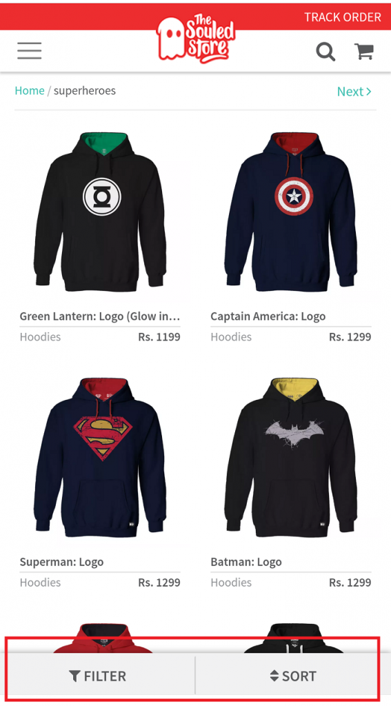
- The products are placed in the Natural area. In the right-hand side image, as you scroll, the choices come in the Natural area.
- Buttons such as Filter, Sort, Add to Cart, and Buy Now are well-placed in the Natural zone at the bottom.

4. Prioritize Uniform User Experience
When talking about UX, context is the key. Providing a uniform UX should be a priority regardless of the device. Your shopper might use a website, mobile app, or mobile website to shop in your store.
Your aim, however, should be to deliver a seamless, consistent UX across each touchpoint. Let’s look at two main UX aspects that you must have on your website to boost the user experience using conversion rate optimization:
Simple Navigation
You can not give too many options on mobile devices as there is insufficient space. Therefore, having simple navigation would always work. It would be best to mention the brand name, a search field, a menu, contact information, your unique proposition, and a shortcut to your cart.
Here is how Zappos does it:
Scale UI for Both Views
Smartphone shoppers use their device on both – landscape and portrait views. Make sure your website is appropriately scaled for each of the views.
5. The Search Functionality Should Be On Point
Smartphone shoppers usually look for products on the fly. They often have a predetermined shopping intent, unlike web shoppers who might be going through your website as the proverbial window shopper.
Therefore, to cater to this specific need, your mobile experience needs to have powerful search functionality. A semantic search tries to grasp the searcher’s intent by understanding the meaning and context of the query hence being better at returning results that are most relevant to the user. A thematic search produces results based on the keyword itself without understanding the context.
Implementing semantic search on your website can improve your chances of improving your CRO (conversion rate optimization).
Conclusion
It’s staggering that despite being in 2018, many e-commerce stores fail to deliver a good UX on smartphone devices. The most significant advantage of smartphone shoppers is that they have already made up their minds to purchase a product.
All you need to do is facilitate their checkout process. Being able to deliver the ideas mentioned earlier will undoubtedly help you boost this process of conversion rate optimization for mobile.


